Until now I have mainly been working with dry mediums when creating art. Last year I discovered pastel pencils (and then pastels), and they immediately clicked with my approach. They are so different from the standard coloured pencil – even though I may find a higher quality version of those more pleasing, now that I know more about drawing in general. Pastels and pastel pencils are kind of chalky and sticky at the same time. Not oily like oil pastels and oil paint, but also not like boardwalk chalk at all. You can blend them and make the lines and edges as sharp or as soft as you like. You have a lot of control once you know what you’re doing.
When I bought the pastel pencils, I also bought some Inktense pencils from Derwent. They are pencils with full pigments, and once you make them wet, you can use them for aquarel/watercolour techniques, and the colours will become more intense after becoming wet. I tried them, and they didn’t click with me at the time, so I gave them all to my friend Snorrepot, who is a wonderful artist and who loves creating illustrations. She has a very lively style and I love her drawings!
Anyway, after we met last Thursday and talked about her work with watercolour (and after seeing the little watercolour set that Pukkieplanta also has), I was intrigued again. I was ordering some stuff for my clay items anyway (some metal coloured gel pens), so I decided to give wet techniques another try. I found a really interesting in-between kind of option: a Pentel Aquash set with ten coloured crayons, a refillable brush, a sharpener, a sponge, and some room for blending colours, all in a neat small box that you can bring anywhere. Interesting!
It arrived yesterday, and I’ve been playing with it quite a bit. First I tried just using the crayons to draw something as I would normally do, and then use the brush to blend a bit and soften the lines here and there.
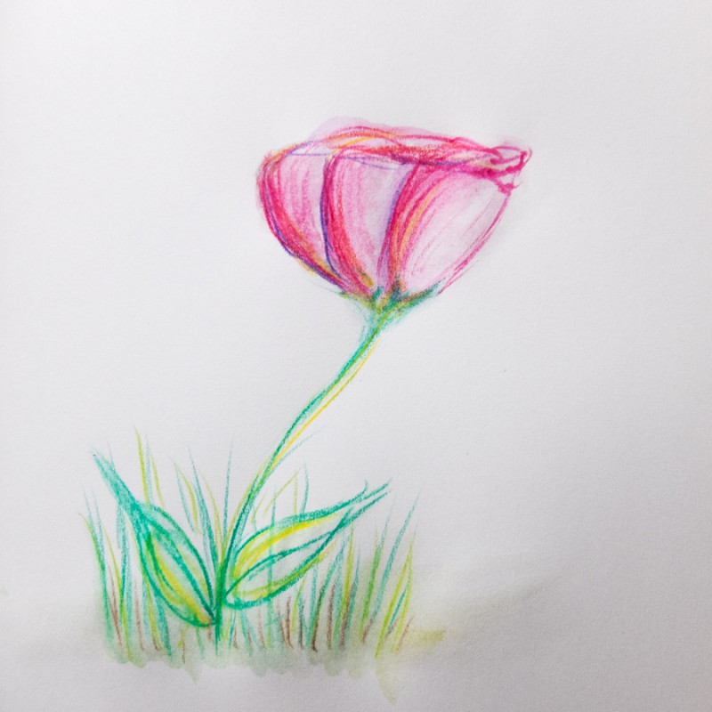
Then I got the great idea to watch some YouTube videos on how to work with this set. Most people apparently did not draw with the crayons at all! They either wetted the tips and painted with the brush from that, or they took some bits from multiple colours, mixed them with some water, and painted that with the brush. So I tried to mix up the techniques a bit and came up with this rather silly drawing:
A combination of drawing with and painting from the crayons. Better, and the colours made me quite happy! Meanwhile it had become dark and I could not really see what I was doing anymore, so I had to stop.
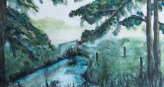
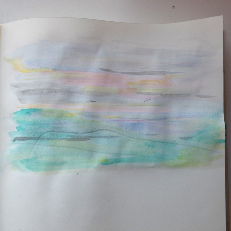
Today I continued and I made a subtle suggestion of a landscape by only painting from the crayon tips, with a lot of water. I was not using great paper for it (my sketchbook with creative ideas), so the pages are now starting to curl. And then I scratched the painting before I could take a proper picture. Oh well, it was just a doodle anyway. In this drawing I was trying to let the paint talk and get inspired by where the colours and edges ended up (way less control here than with pastel painting!).
After this, I moved on to a set of blank postcards that I still had. They are not made especially for painting, but they are thicker than the pages in my idea book, so I gave them a try for this. They did work better, still some curling, but much less than before.
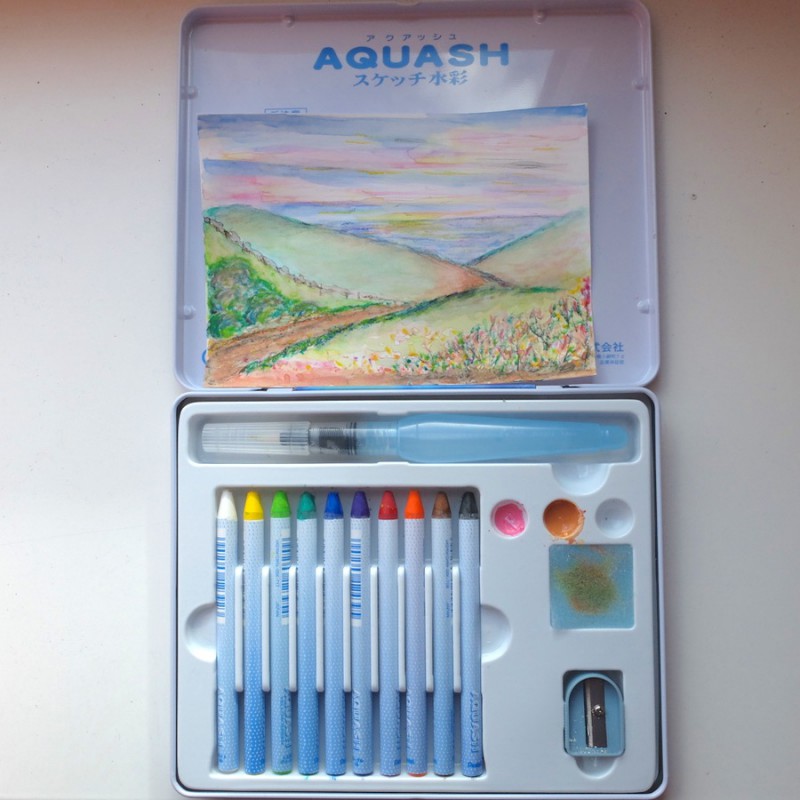
I just sort of imagined a dreamy, brightly coloured landscape, and in it I tried to combine some more detailed/dry bits with some more fluid/suggestive elements. It’s not easy! You have to take care to work from light to dark colours, because if you paint the other way around, you won’t be able to make things lighter than their background. You also have to take care to let the right bits flow (or not).
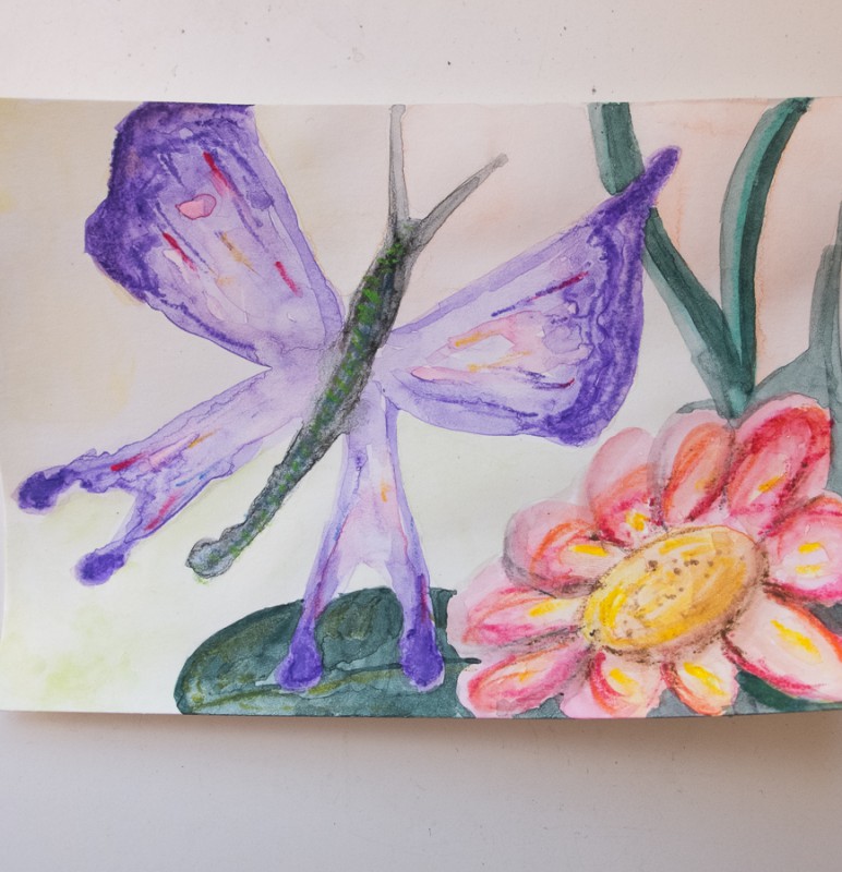
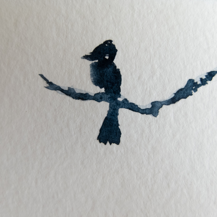
The last painting of today is a liquid butterfly… I wanted keep the edges flexible, maybe even droopy, and I wanted to experiment with putting different hues of the same colour into the painting on purpose. For example, I used the purple crayon for all the purple bits, taking care where it should be light or dark. I added small bits of other colours to make it more lively and interesting. I’m not too fond of the flower (and of the fact that the butterfly didn’t fit on the card – I had just started painting without sketching first). But I’m learning with every painting, and enjoying the process!