Yesterday, Naomi, Jojanneke, Trude and I went to see a real colour analyst! We had already been curious about our colour choices for a while, and now we finally made an appointment to see if they were right or not. Before the colour analysis, I used to wear bright and darker colours, mostly purple, red and blue. Trude also loved bright colours, preferred them intense and sometimes added a touch of orange for some warmth. Jojanneke used to wear light colours, like light blue, light lime green, and in combination with black. Naomi wore darker colours, a little muted. What would the expert say?
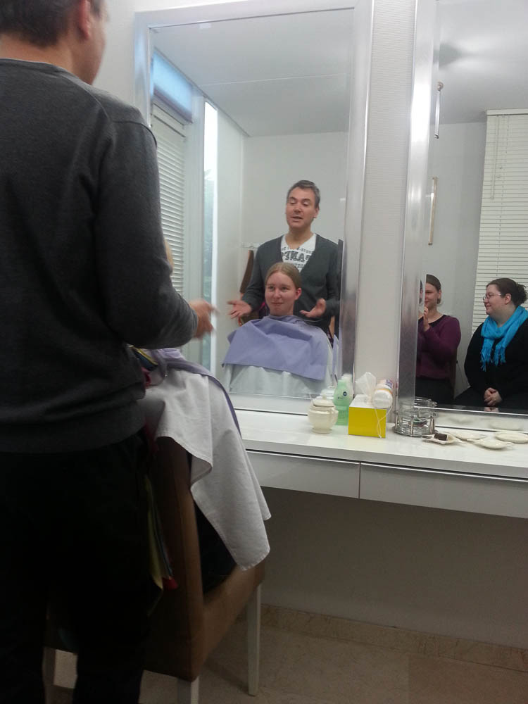
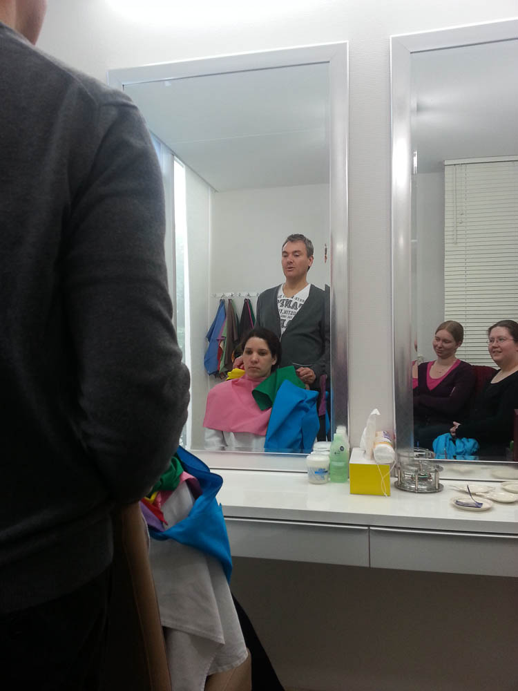
Trude went first. Michael draped some cloth around her neck, two different flavours of pink, one quite soft, the other quite intense. We all saw it happen: she looked much better with the soft pink! Alarmed, Trude started to fear for the worst, and she was proven right in that… pale, pastel colours look amazing on her, they make her face more refined, less spotty and she looks brighter. It was not what she wanted to hear, though. Michael found her quite easy to classify, because her type was very clear: a light summer.
Jojanneke was next. Jojanneke and I are a bit alike in our skin tone, so I payed close attention. With Jojanneke, the cooler colours also looked better, although she also looked good in colours with a hint of warmth in it. The lightest colours might not have been her best, but did look okay. A bit darker, and the colours looked perfect. She was a summer too! A darker summer than Trude, though, and she could handle a hint of warmth and brightness.
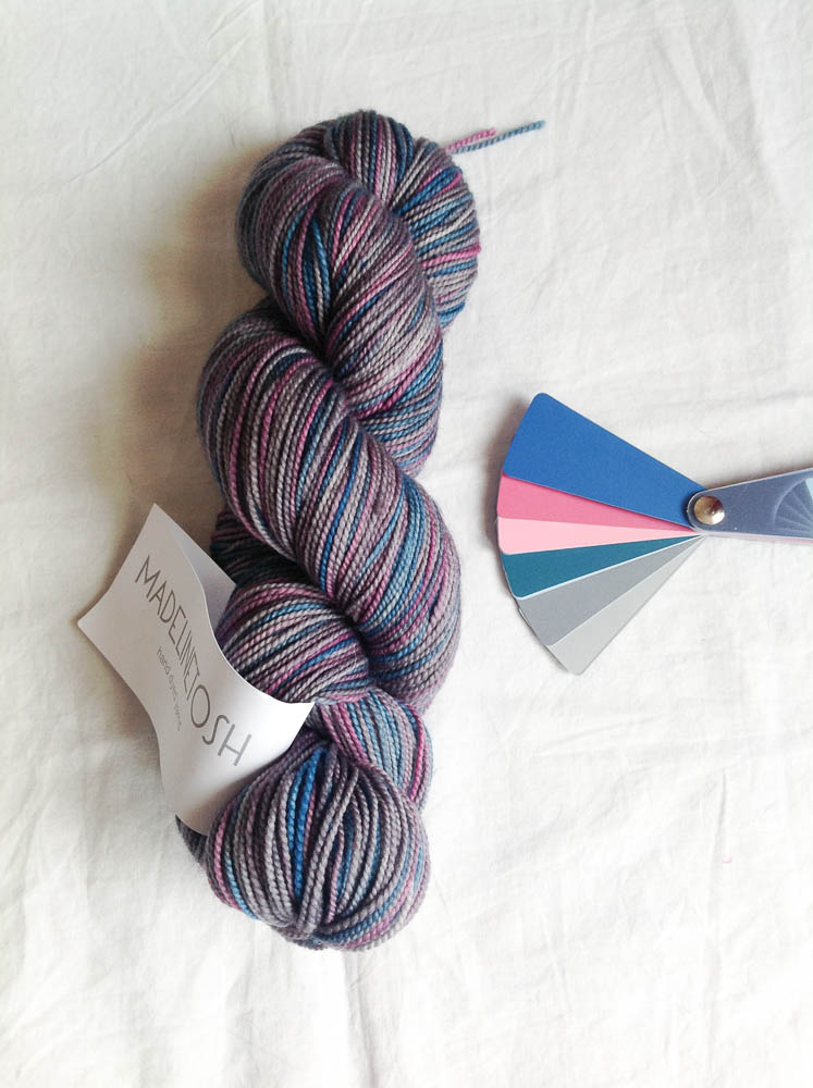
Then it was my turn. I suspected that my type would be similar to Jojanneke’s, and it turned out I was right. The nuances were a bit different, though. My face could not take a hint of warmth, only real cool colours looked good. The light colours were too light, so I needed the medium to dark colours from my spectrum. My best colours from the cloths were the dark cherry, the taupe, the misty sea blue and the silvery dark green. Conclusion: a dark summer.
Finally, Michael had to classify Naomi, which turned out to be rather complicated. Both warm and cool colours looked good on her, however, dark colours did not. Neon yellow was no problem, neither was cognac brown or bottle green. Apparently, for Naomi the brightness of the colour was the most important aspect, before warm or cool. She turned out to be a clear winter-spring, of which the spring part is more important. No pink or orange for her, but brown is good.
We all got a fan with the colours and hues for our respective seasons.
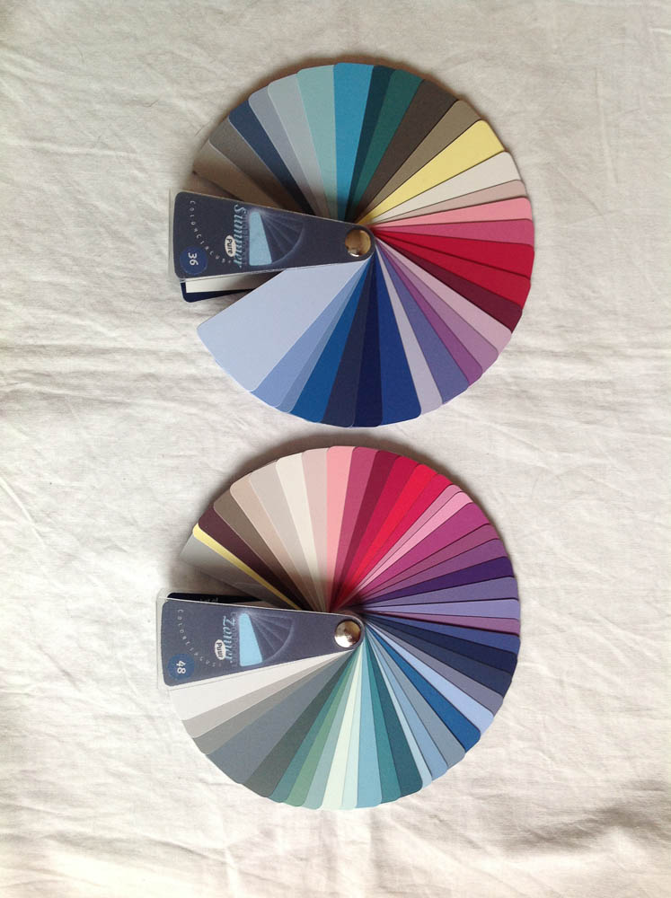
This analysis was a very interesting and fascinating experience. It’s inspiring more questions too, like, can I take “more” of certain colours (in brightness, lightness etc.) than from others? I do have the feeling that pinks/purples look generally good on me, but that not all shades of blue or green in my fan do. Maybe I will go for a second analysis at a later point in time.
After the analysis, Jojanneke, Naomi and I went to Den Haag for some drinks, and then we went to Woool to get some yarn in our new colours. It was very handy that Jojanneke and I could use each others face as a kind of mirror to see what would look good on us. We all scored some yarn in our new colours. It was interesting to see how our “filters” were already shifting while looking at the yarns.