Another seascape postcard today! This time I was trying to make it less vibrant, more stormy. Higher waves, greyer sand, less colour… but still three dimensional. It was not easy! I wanted to paint the sky in the grey green colour of thunderstorm clouds, but did not manage to make it quite that intense. The shapes are a bit vague, not very detailed, because I wanted to suggest more than put in extra details.
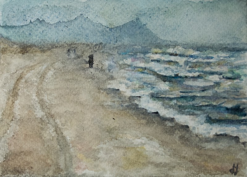
The bobbly paper is more prominent with these paler washes. I’m not sure that I like it. Well, I do for the beach, but not for the sky. I do like the feeling of depth in the painting, but I think I do need some sharp details, especially in the distance. However, that part first did not work because the beach, sea and sky mixed together too much. I waited until it was dry to try and fix it a bit, but there are no highlights left, and the suggestion of walking people in the distance is not quite clear. I may try to fix that tomorrow when the painting is really dry. But the gloomy colours and atmosphere are quite accurate.

Oooo…. pràchtig! …..