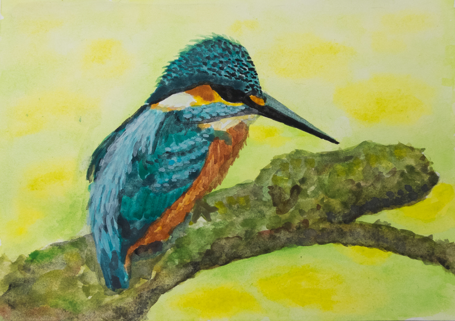
No postcard today. I decided to paint a bit in my sketchbook, just improvising with the colours of the Winsor & Newton set. The paper is quite thin, but that’s okay.
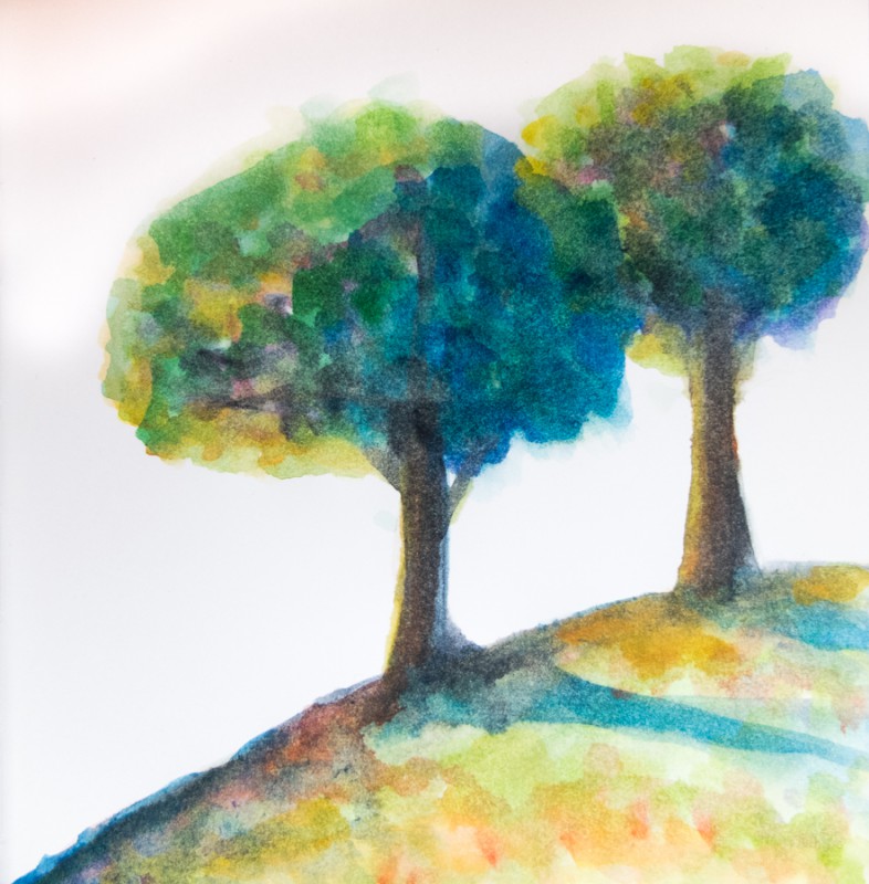
I tried to use bright colours and mix them where needed to suggest sun and shadow. I like really the vibrance of the colours. There is no background, but I did not miss it – it could just be the overexposed sky.
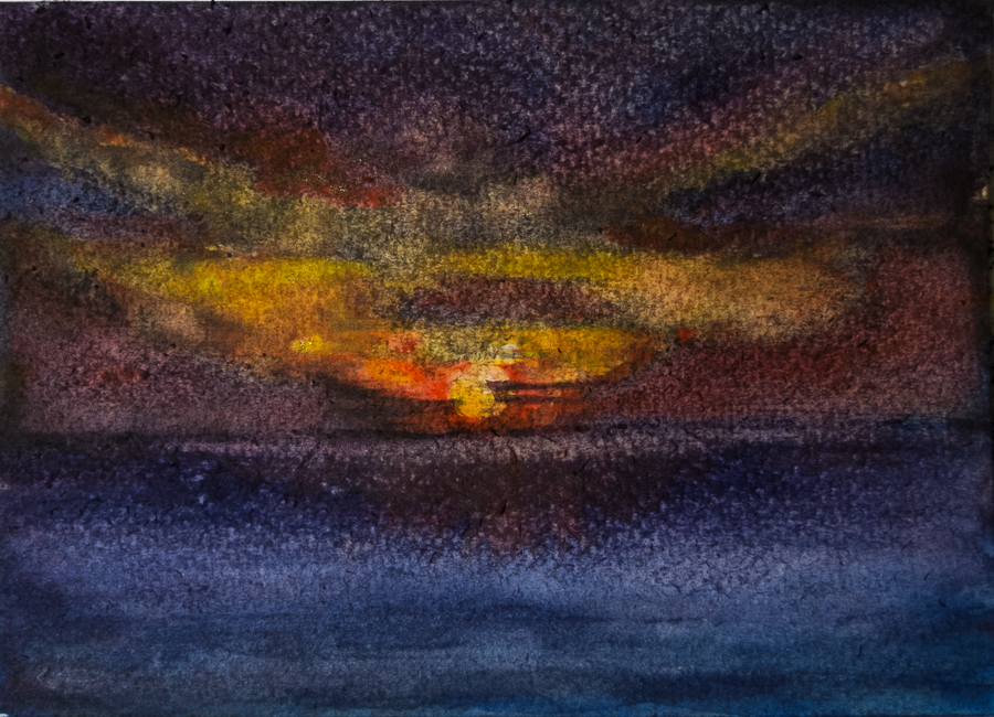
Then I painted on my Søstrene Grene A4 paper again. This time I wetted the paper before sticking it to my board, but I think I may really need to soak it to avoid bobbles. I waited until it was dry again and started working on a landscape.
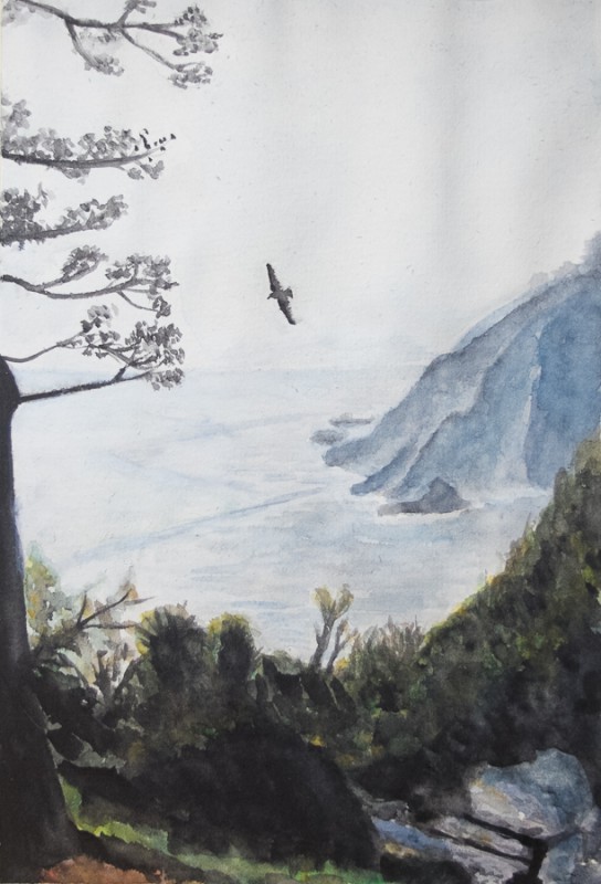
As the light comes from the back left side of the painting, much of the foreground is in the shadow. I tried to still keep some texture there, despite the really dark tones. It worked out quite nicely. The sea is not as good as I hoped, the left side should be brighter, but my paper is slightly tinted (yellowish) and there is no screaming white there to make the contrast more prominent. Adding white paint does not really work, as it’s mostly translucent.
The colours are more muted in this painting, and I have tried to avoid filling in too many details. I wanted to suggest them, not paint them. I think I should have made the cliff on the right a bit darker (less contrast within), and make the bushes on the top sharper. Overall I’m quite happy and it was useful practice again.