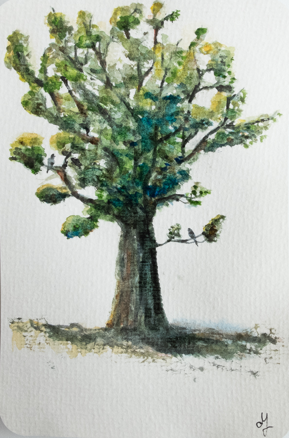
My small study of today is part of the ceiling of a room in Casa Battló (Barcelona). I have tried to play with different values and temperatures of neutrals. The white is just the paper. I’m also still learning to use my brush such that it paints what I want – the fact that it is flexible gives me less control than when I’m using a pencil, for instance. That, plus the fact that the watercolour paint is also flexible, makes the learning curve quite steep (pun intended). I used 4 colours for this painting (burnt umber, paynes gray, some white and alizarin crimson), to blend all the colours in the picture.
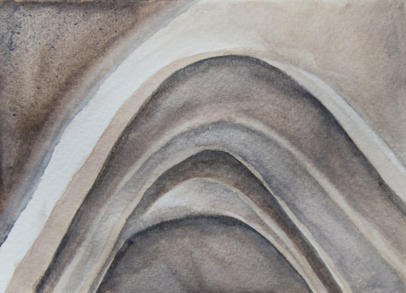
Curves & Neutrals (10 x 15 cm postcard)
Yes, colour names! They speak to my imagination. I found out the names of the Sakura Koi set and made a test sheet with all the colours in my notebook. These fancy names make the colours even more pretty. Someone cared enough about them to give them a respectful name.
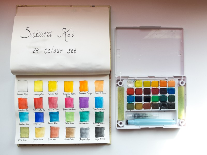
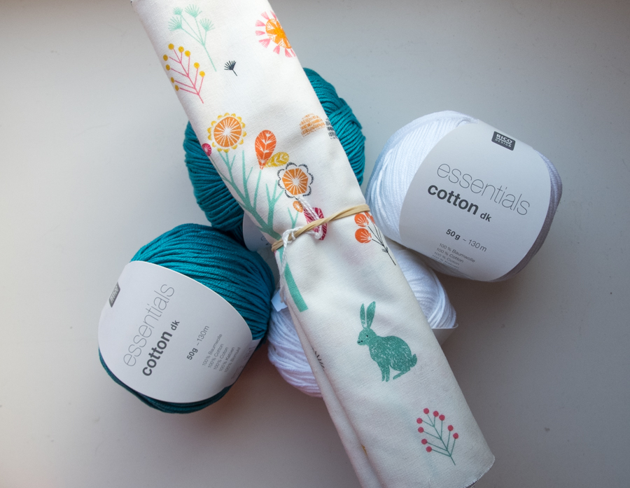
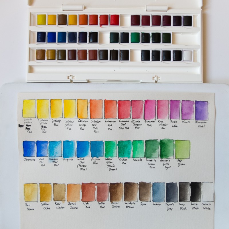
And yesterday I received another watercolour set, this time from Winsor & Newton. Cotman is their student grade (artist grade is a bit above my budget for now) and I found a really good deal that I could not resist for their Deluxe Studio set with 45 half pans (40 colours and 5 extras). Everywhere else it was at least €20-30 more! When it arrived I made the test sheets for both the Sakura Koi and this new set.
It’s interesting to see how some of the pans are so very dark, but produce a bright colour! See for example the top row, third from the left. Gamboge Hue looks like brown, but is actually more of a bright golden colour. The cool reds and purples are also much darker than the warm reds… The test sheet will come in handy for sure!
So now I have two watercolour sets, one for painting on the couch or outside (Sakura Koi), and one with more colours (Winsor & Newton) for when I have some more workspace. Oh, and I have the Pentel crayons, of course, but in hindsight that is not a great set for me. It was a nice introduction to watercolour, but I just want to paint now, and having the paint in the form of a crayon is not that great. But you never know, I may find a great use for them yet. Perhaps I will start a journal and combine them with a sharpie…
Today’s picture was made with the new set. And yes, I know that one does not need many colours to paint. I could mix them myself if I had warm red, warm yellow, warm blue, cool red, cool yellow, cool blue and white, but when working with pans it’s quite convenient to have a bigger palette.
I may at some point buy those basic colours in artist’s quality (in tubes) and really paint “from scratch”. The purer pigments of the artist quality paint should be helpful in making better mixes as well. But first I will just keep exploring watercolour painting from my pan sets, waterbrush, and postcards, and try to get a bit decent at it.