At the moment I’m reading The Artist’s Complete Guide to Drawing the Head by William Maughan, which explains very clearly how to draw a head realistically (with techniques that go all the way back to the Renaissance). I found out that I actually already was drawing like that (in an intuitive way): drawing the shapes, the transitions between light and dark, not the lines. Maughan explains how to make monochromatic drawings, using a grey surface, and a white and a red pencil or pastel. The surface serves as the midtone, whereas the highlights are drawn in white and the shadows in red.
This technique makes so much sense. What we see is all about light, after all, and if we draw what the light produces, we can draw in a realistic way. Hence the name chiaroscuro, which is a combination of the Italian words for bright (chiaro) and dark (oscuro).
Until now I had been drawing in a simple sketchbook with thick, smooth paper, not the best choice for pastels. Pastels need a surface with a bit of tooth, otherwise you can’t draw too many layers before the chalk starts falling off the paper.
I bought some real pastel paper a week ago, but it was quite thin, and I didn’t want to draw on the paper and have the pressure damage the next paper. So, today I went shopping for a support. I know they sell that stuff at art shops, but I thought I could find a cheaper solution: a smooth, thin cutting board. I visited some cheap stores in the mall and managed to find a nice white one for only 3 euros or so, and I bought some (happy-coloured) clips to attach the paper to the support.
Tonight I finally could get started. I took out my pencils and decided to draw another drawing of my little niece (who is adorable by the way). This time I was drawing on tinted paper (light brown) and I decided to put the things I learned from the book into practice: use the paper as the midtone, and add shadows and highlights. I did choose to draw with more than just two colours, though. As long as I keep looking at the picture from a distance from time to time, to see if I get the tints correctly, I should be fine.
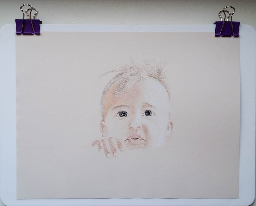
Unfortunately it became dark way too soon, and I had to stop drawing. I will continue tomorrow, but drawing like this is fun, and the likeness of the picture is already showing. Drawing on the rougher paper takes some getting used to (I keep trying to fill the “vales”, which doesn’t really work), but I think I will be able to make more complex drawings layer-wise.