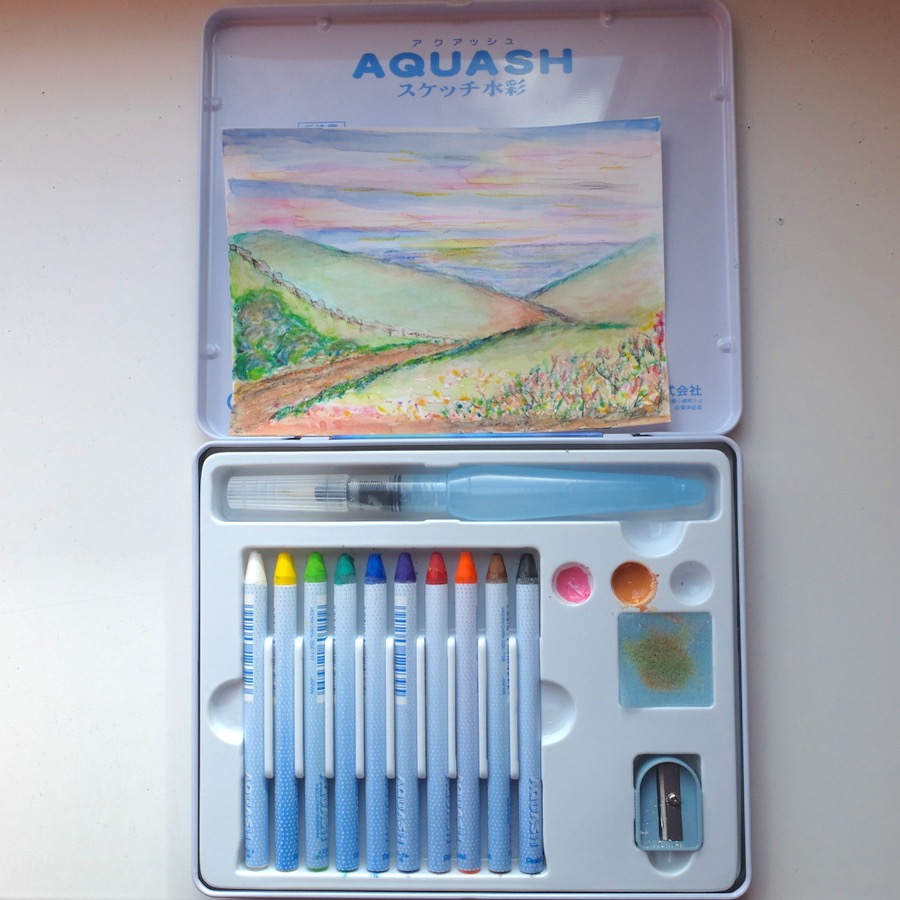
Last Saturday, I bought some very nice colour pencils in an art shop. I had been wanting for over a year now to start drawing stuff again, now that I know more about colours and their effects on eachother (because of all the yarn stuff I do, and the photography), and I finally decided to do something about it. I’ve always loved drawing, but mostly did it in school, with cheap, low-quality materials. This time I allowed myself to indulge a little bit: I bought a 12-pencil set of pastel pencils (ColorCreta) and a 12-pencil set of Inktense pencils (Derwent) plus four extra colours of the latter. And a simple sketchbook.
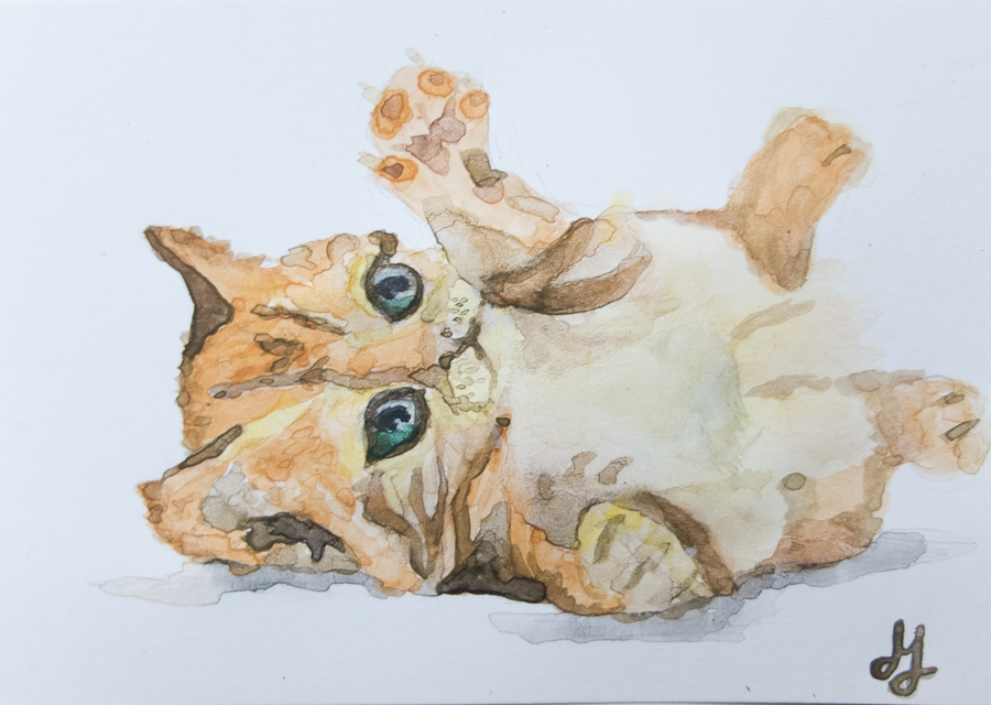
So yesterday I tried the Inktense pencils. I decided to draw Freya, my cat, as she was lying down near me (but of course she moved once I had outlined the sketch…). I used the dark brown pencil to draw the basic sketch, and then took the orange and black pencils out to make some colour highlights. The dark brown almost looked like black, not what I expected…
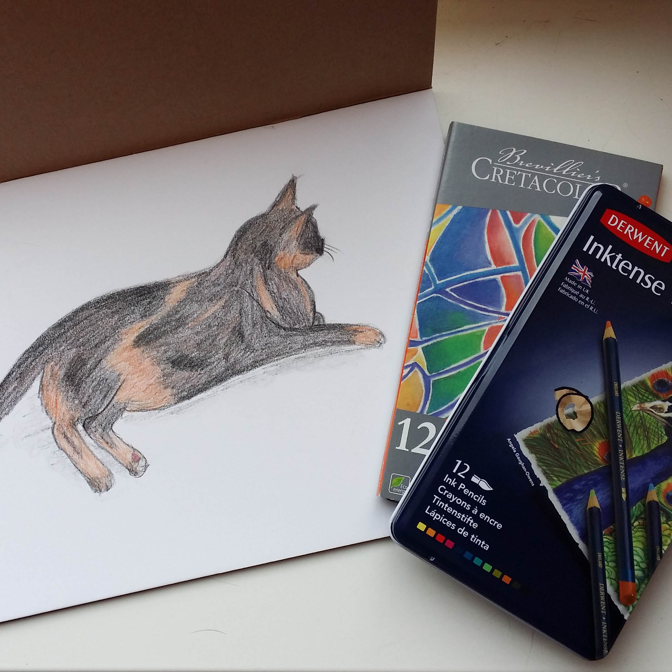
I did my best to at least follow the direction of Freya’s fur when colouring the drawing, but the fur looks to course, her hair is way thinner and softer than on my sketch. Also, the colours are not that “Inktense”, at least not immediately. I think I will need to wet the drawing a bit and blur it more, which is part of the workflow of these pencils according to the box.
Today I read a little bit on a drawing forum, and found out what one of my mistakes was: I didn’t start with the lightest colour, but with the darker one, and if you draw the other way around, you cannot cover or tone the darker colours with the lighter ones, at least not with these pencils. The other way around should be fine, though.
This evening I decided to practice that theory with the other set of pencils, the soft pastels. I looked on my iPad if I still had a photograph somewhere that I would like to draw. I found one, of my little niece Isabel and decided to give it a try. I started with yellow and gradually built the drawing up… orange… red… pink… purple… green… brown… black… and it worked! My drawing was getting depth!
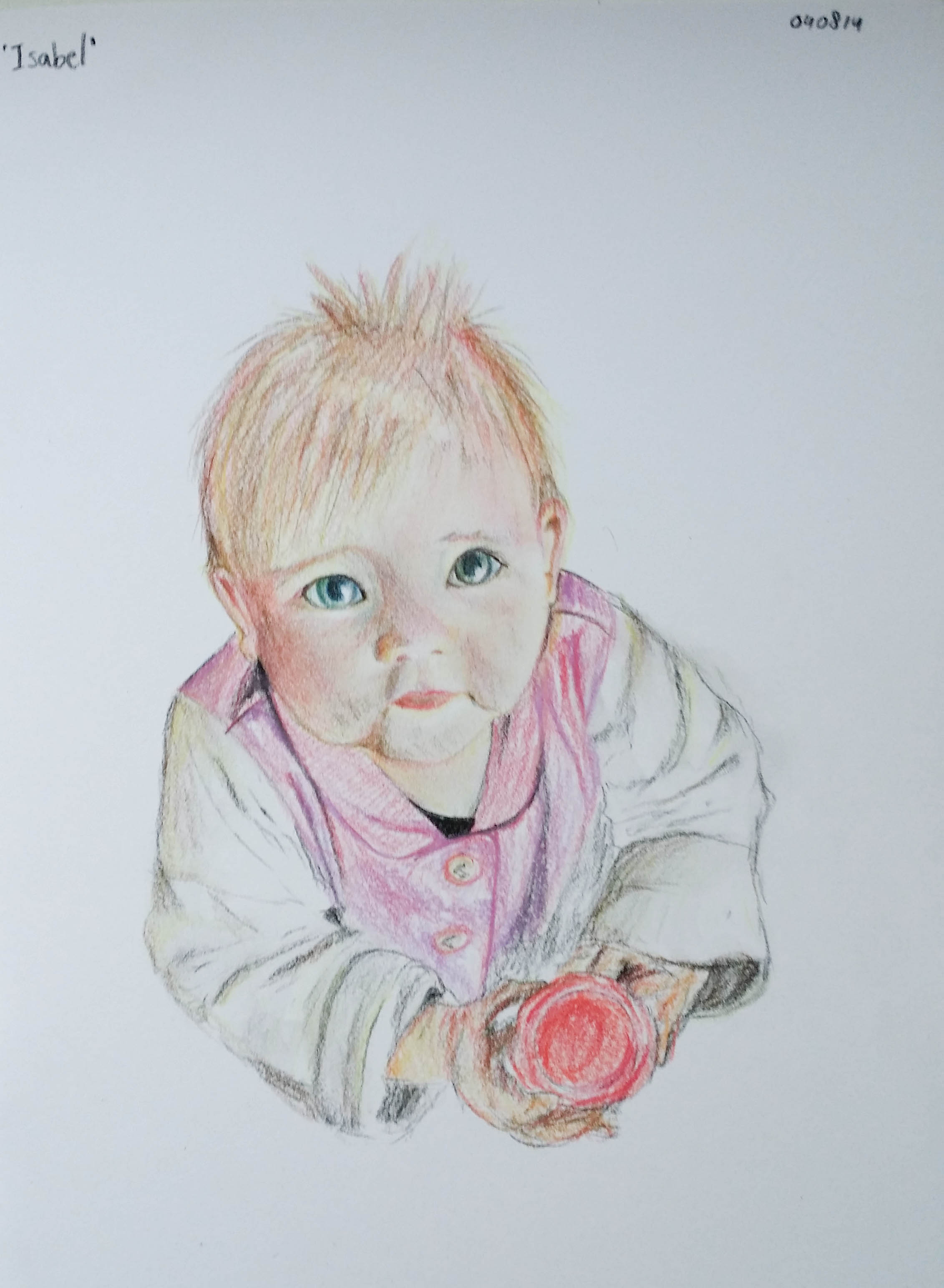
The photograph has a warm overtone, which is why there is quite a lot of yellow and orange in the drawing as well, but that’s also because the lightest cool colour pencil I own is quite a dark pink, and that would be way too intense for the light basis. I think I need to purchase some more pencils in light, neutral colours for the skin tones and the like. Mixing the colours works quite well, though, and the advantage of pastel pencils is that you can work both from light to dark and from dark to light. These pencils appeal to me more now than the Inktense ones, but that’s probably also because this time I knew what I was doing.